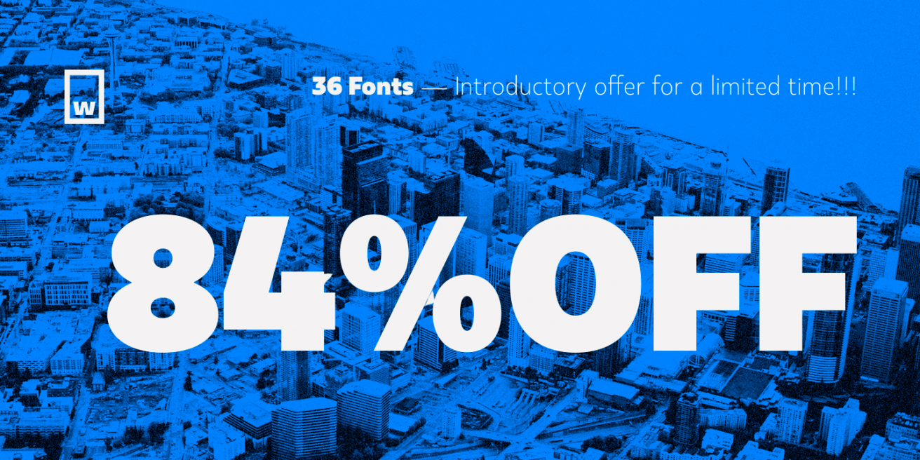
Five Amazing New Families from W Foundry!
|
|
|
|
|
Every so often a month has five Thursdays. When
that happens, we put together a special edition of Underlined where we stretch our wings and
try something different. Today we’re doing that by focusing on a whole foundry, one that's
been part of Fontspring for a while, “W Foundry.” If you’re wondering why, it’s because we
have five awesome new font families from them. They’re all highly usable, they’re all
beautiful, and they’re all on sale. So without further ado, let’s jump in.
|
|
|

|
|
|
First we have Fuse and its sister font, Fuse V.2.
Both are slightly humanist fonts with a more geometric bent; more related to a “Meta” than
your normal Helvetica or Proxima Nova style text fonts. I really like Fuse V.2 in
particular, which is a softer and friendlier version that the original, with slightly
rounded corners. Fonts that aren’t very round but just slightly rounded can be very
effective now as text fonts on higher DPI screens, bringing some warmth to your designs and
making them less corporate feeling.
|
|
|

|
|
|
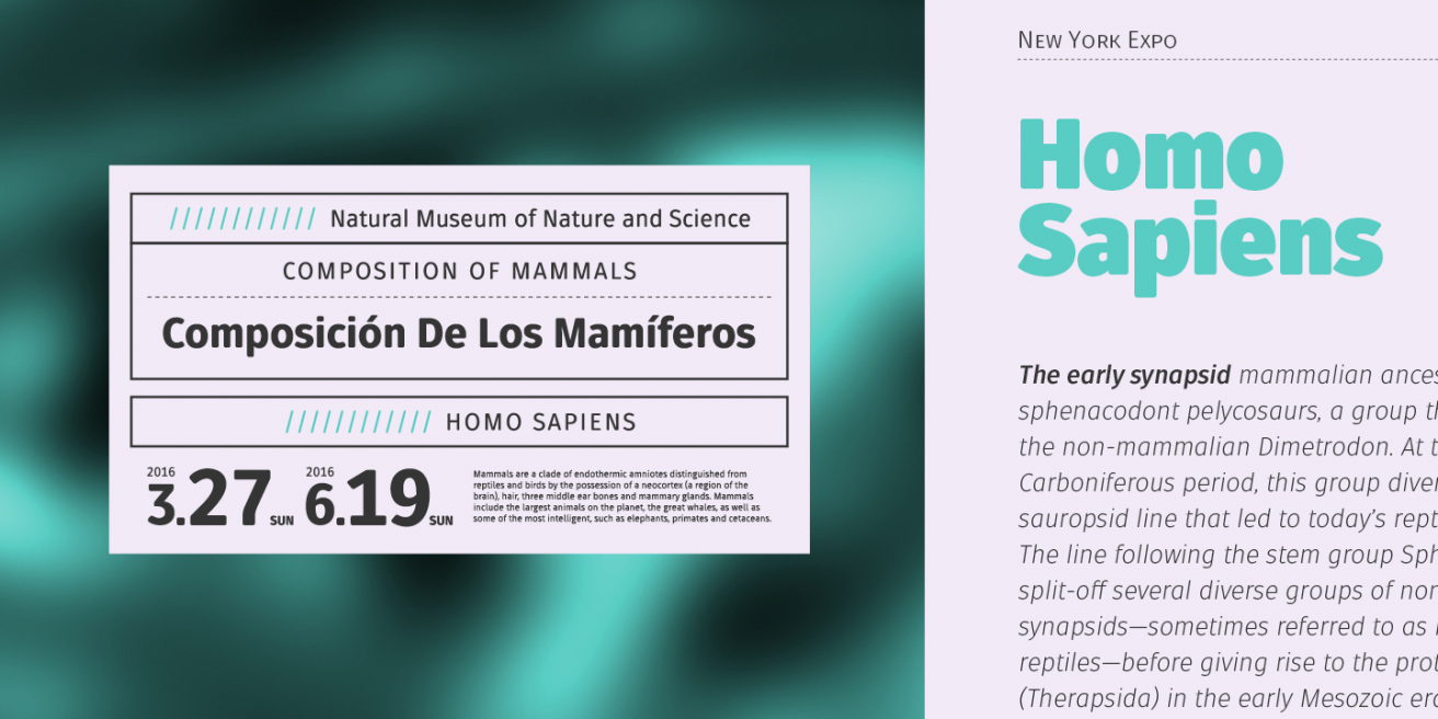
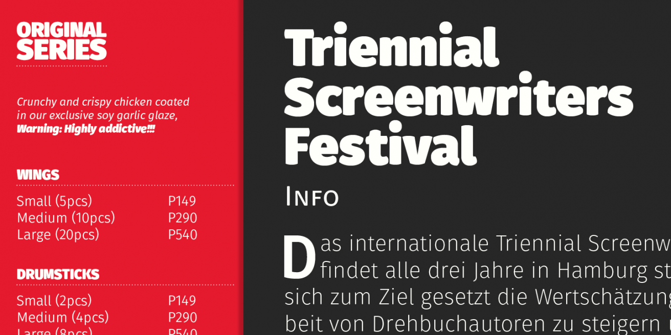
Then there’s Kappa, which takes the geometric style
with narrower proportions and runs with it. I should take a moment here to mention that many
of these fonts have 2 sets of styles, a “text” and a “display” style. I think Kappa really
benefits from the “display” style especially, it’s got enough character to make headlines
pop. If you want clean headlines and display work, this is the font for you.
|
|
|

|
|
|
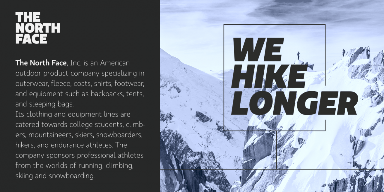
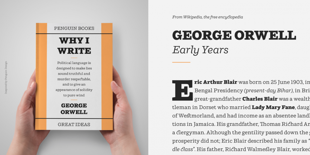
Taking a step out of “sans world” we go to Ulises.
Ulises is a modern slab serif font, but its serifs are thinner than your typical slab. This
blurs the lines between older styles serifs and the purely modern slabs. The result is a
font
that looks equally good starting off a corporate headline as it does filling the text of a
cookbook. The thin and heavy weights especially have their own character and work great for
branding.
|
|
|

|
|
|
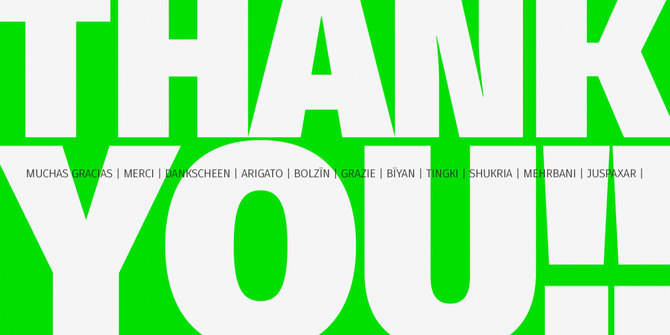
Finally we have Gardenia, a display sans through
and through. Rounder and bouncier than even Fuse V.2, it will inject some fun if you blow it
up big and add it to your design. While it has a fun appearance, it’s still a sans first and
foremost, so it has the legibility you need when your message is important.
|
|
|
All in all, these are 5 font families that you
could
get some serious use out of, and thanks to their sales, you can buy all of them for the full
price of a single family! W Foundry has some real talent, and we’re excited to see where
they go
from here.
|
|
|

|
|
|
Grab any of these font families for a great low price!
|