JTD - Classic Styles With Modern Refinement
|
|

|
|
|
Today in our bonus edition of Underlined, we’d like
to
reintroduce you to a Philadelphia-based type designer, James Todd. James only has four
retail
font families on the market, but each one is an excellent example of the genre it typifies.
|
|
|

|
|
|
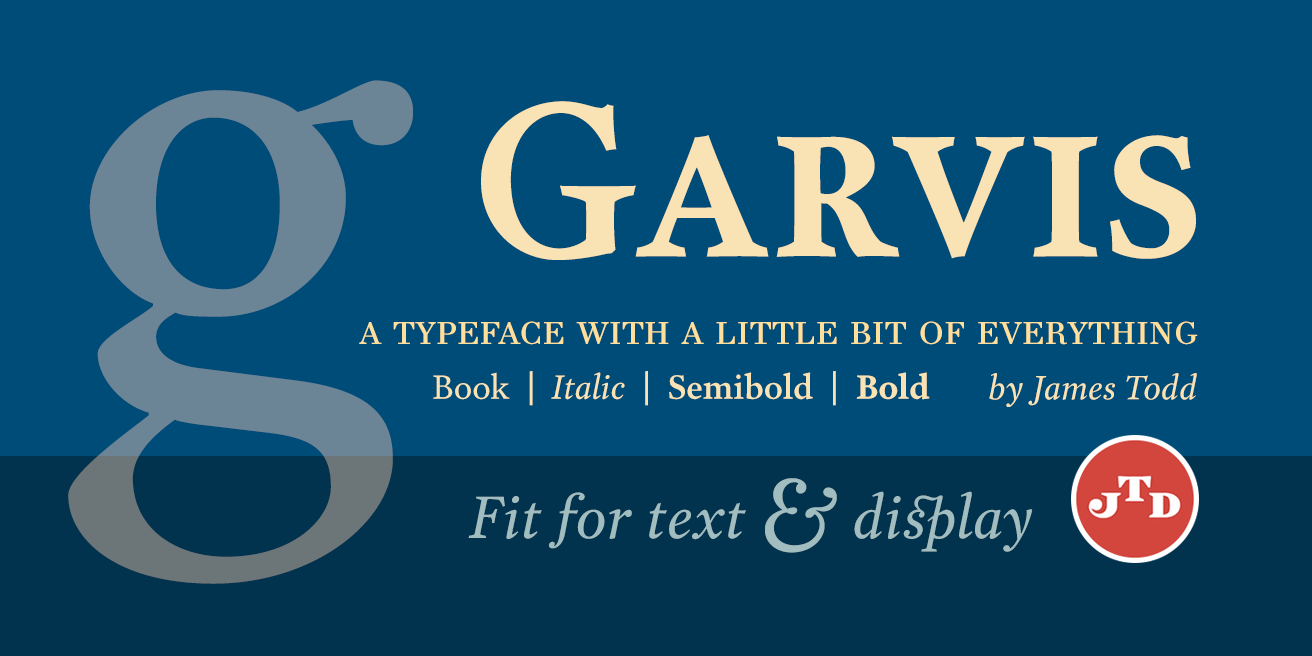
Garvis Pro was released a few years ago, and had
the distinction of being one of our best sellers. It’s a serif that draws inspiration from
turn of the century forms and still holds up in modern designs. It reads well in large and
small print, making it ideal for both book cover design as well as inside text.
|
|
|

|
|
|
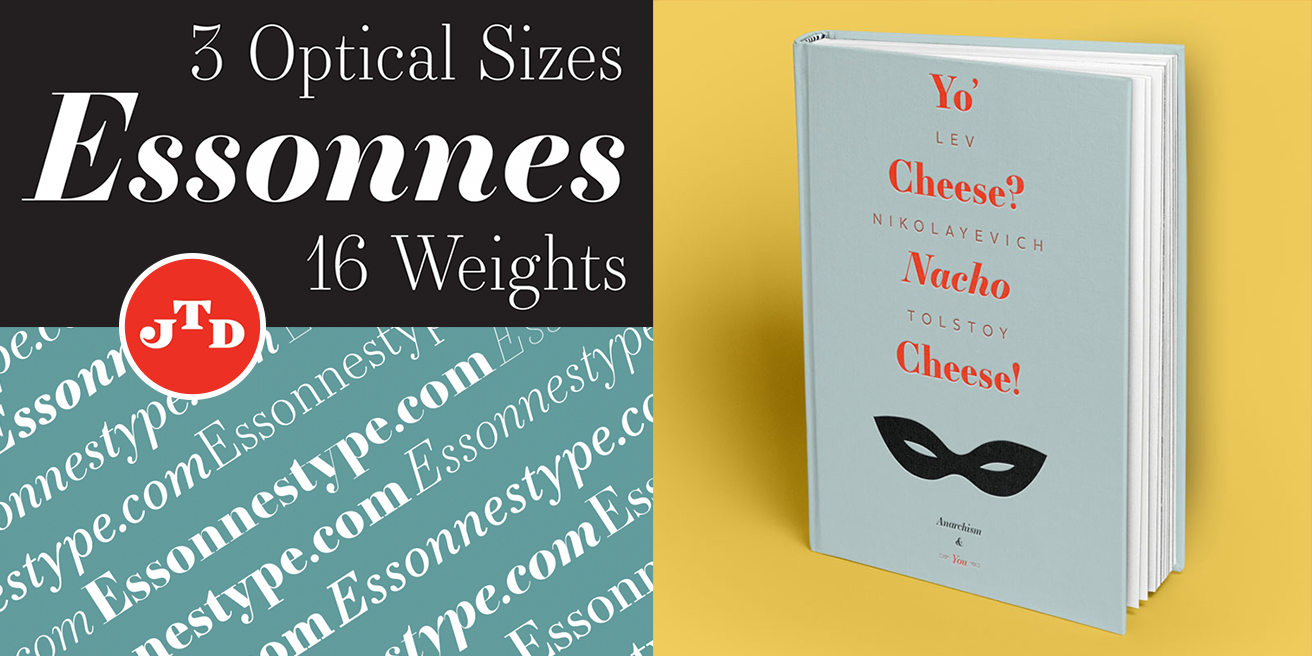
Essonnes functions in a similar way. It’s a modern
take on the didone style and its elegance stands out as a large display and still holds up
beautifully in longer paragraphs. James emphasizes this by providing text and display
weights, adjusting contrast and overall feel.
|
|
|

|
|
|
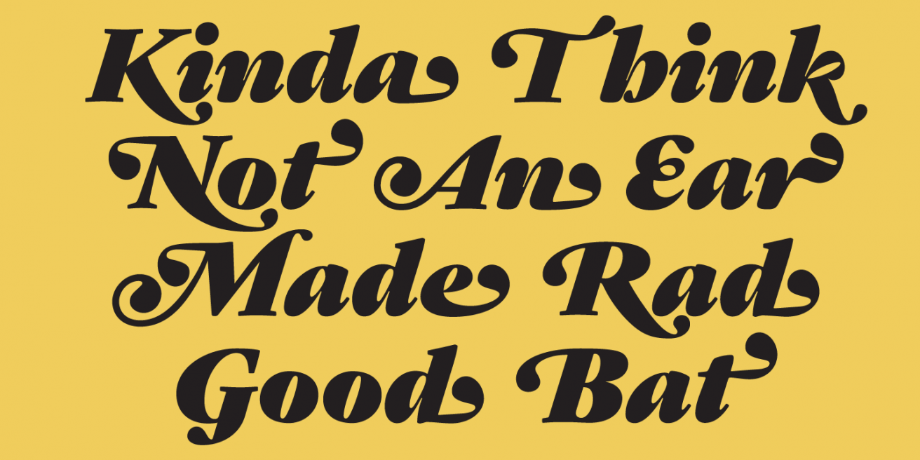
Gastromond, like many fat typefaces, exudes a “I'm
here to have fun” vibe. Not many attempt to pull a display face out of this type
classification, but James makes it look easy. We find the italics particularly delightful,
and downright eye-candy when you turn on the swashes.
|
|
|

|
|
|
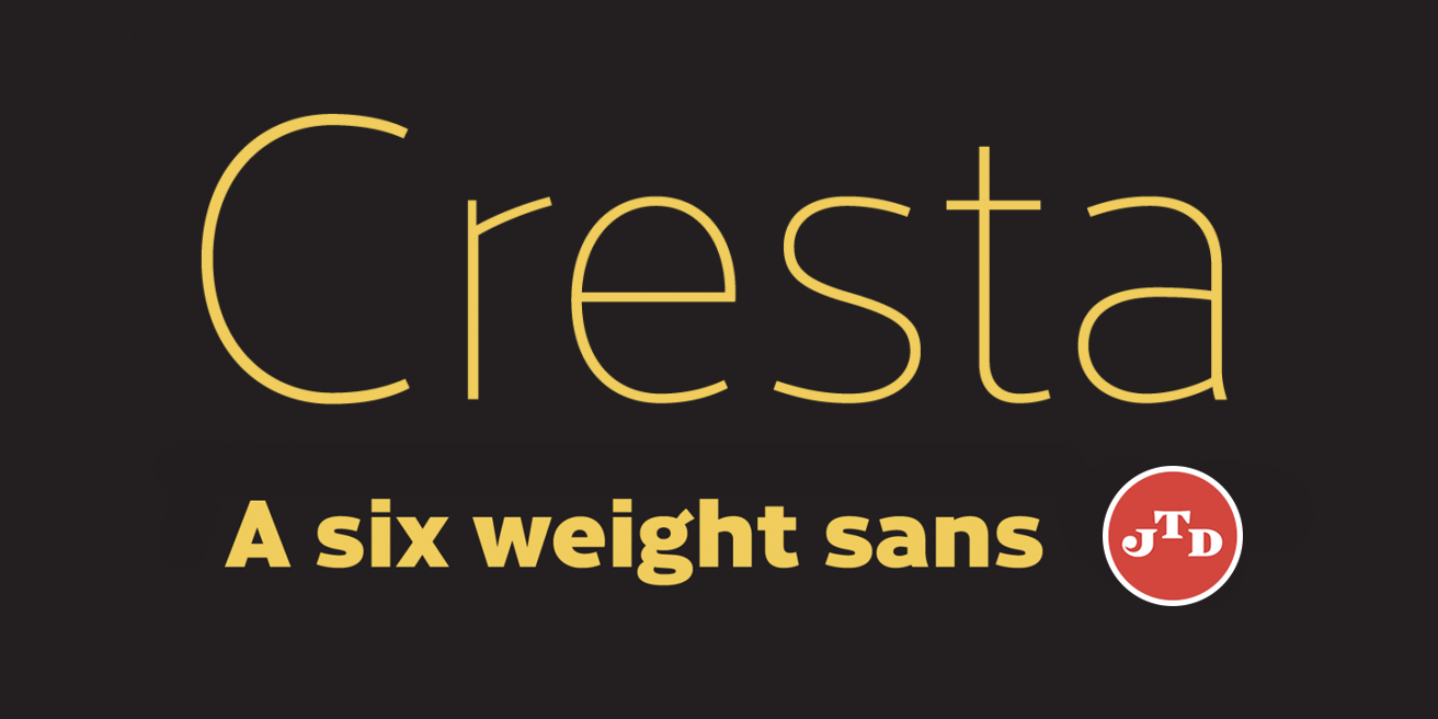
For all of you sans addicts, there’s Cresta. Unlike
James’ other fonts, this one was built without a reference or style he was trying to
modernize. Instead, he created the workhorse sans he needed. The result is a 12 font family,
which gives you enough options to pick from without overwhelming you. With clean lines and a
high x-height, you can put it just about anywhere you want and it’ll look perfect.
|
|

|
|
|
He is not prolific. He does not rush. But he is
good. Really, really good. Take a look and come back when you are ready. You don’t buy a
James Todd font on impulse. Instead you wait until you need the quality, craftsmanship and
attention to detail to perfect the design you worked so hard to make sparkle.
|
|
|
Grab any of these font
families for a great price!
|