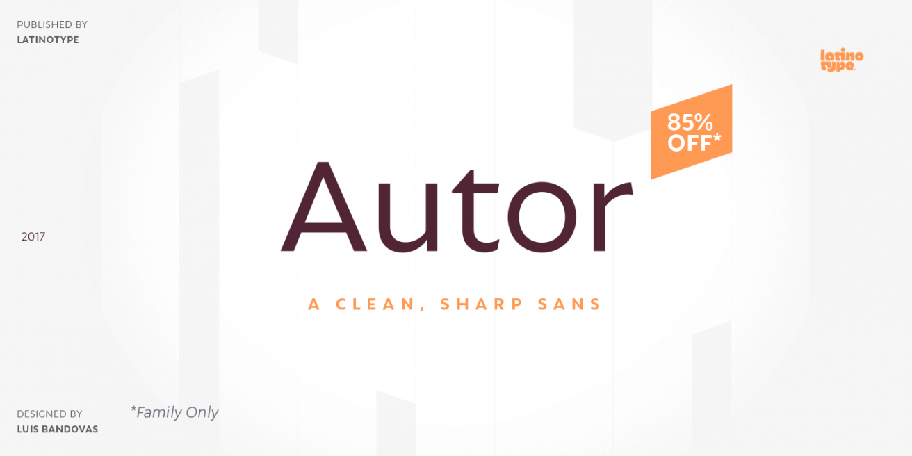
Autor - Straight to the Point
|
|
|
|
|
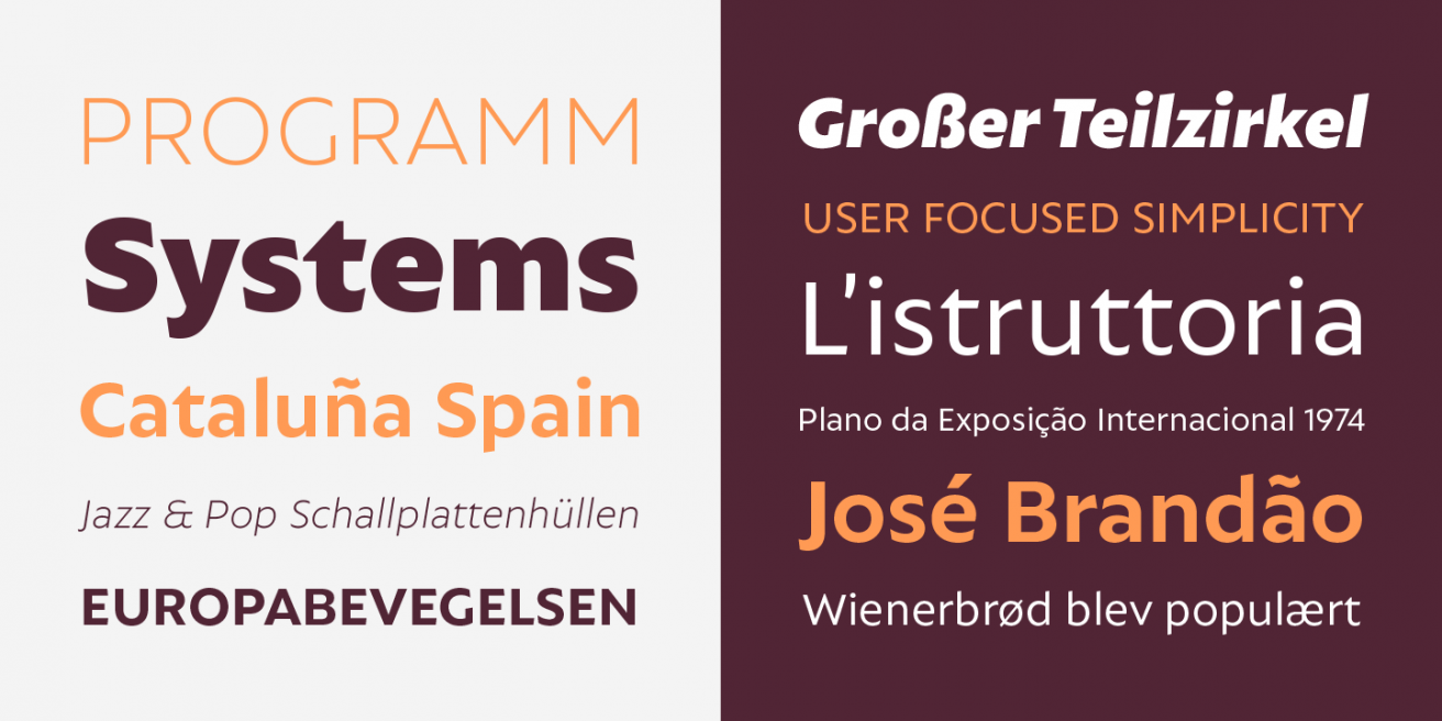
This month, Latinotype
released the latest addition to their stunning lineup: the Autor family. With crisp angles
and a
generous x-height, Autor gets down to business like a sharp knife through butter.
|
|
|
Pick
up this 14 font family for just
$30!
|
|
|

|
|
|
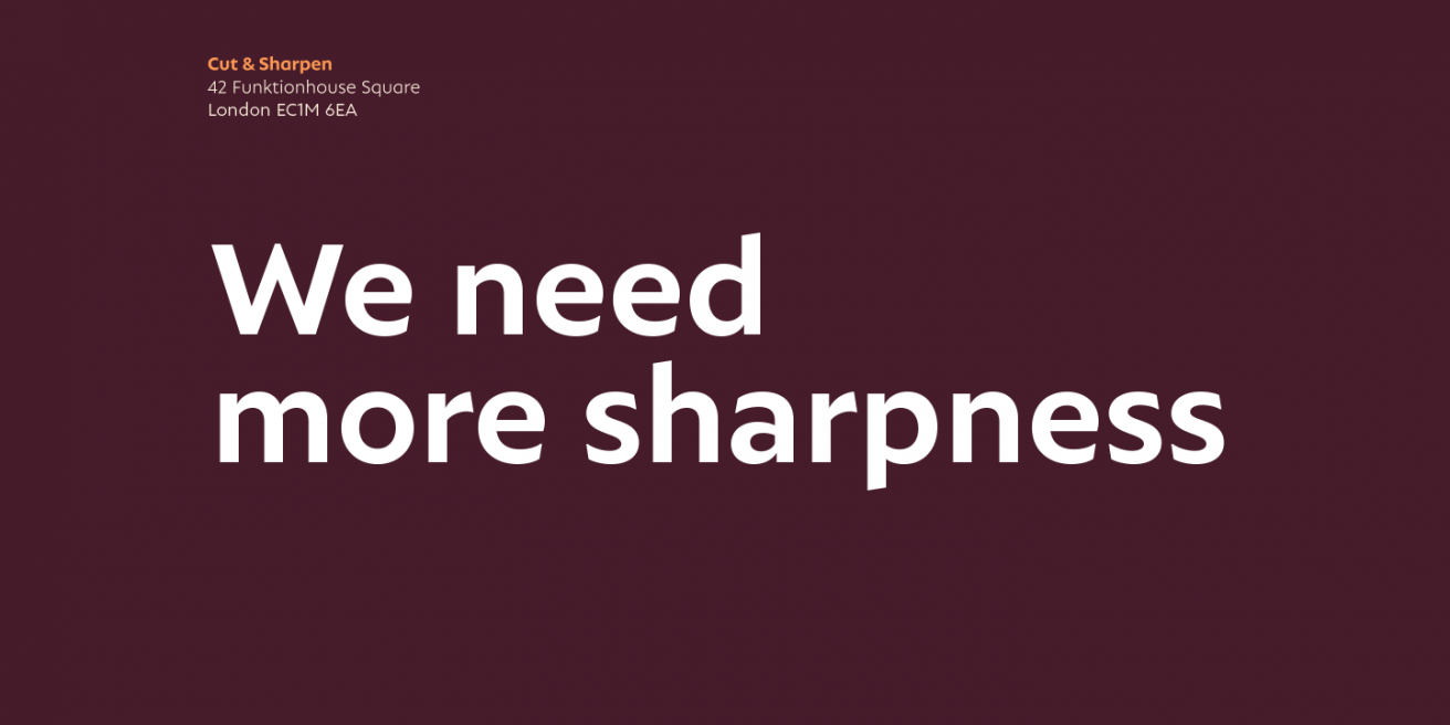
Like any great sans serif, Autor will get the
message across without distracting the reader along the way. Nonetheless, we hope you’ll
take a second look to appreciate its fine craftsmanship. The medium contrast gives it a
smooth sense of rhythm and the pinched curves add subtle depth.
|
|
|
|
|
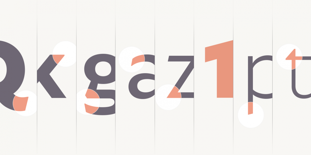
Let’s also take a moment to acknowledge those
angled
terminals. This is where Autor really shines. The lowercase t is a good case in point, not
to
mention the snappy-looking lowercase g. Even the lowercase l has a bit of an edge.
|
|
|
|
|
With seven weights plus italics, you won’t be short
on
styling options. Since the Autor family is so clean and sharp, it’s perfectly suited for
both
display and body text.
|
|
|
|
|
Latinotype has cut the price tag for the complete
Autor family, so you can pick it up for 85% off during their introductory offer, now through
December 21st.
|
|
|
Grab
this 14 font family for only
$30!
|