
Museo Sans Condensed by exljbris
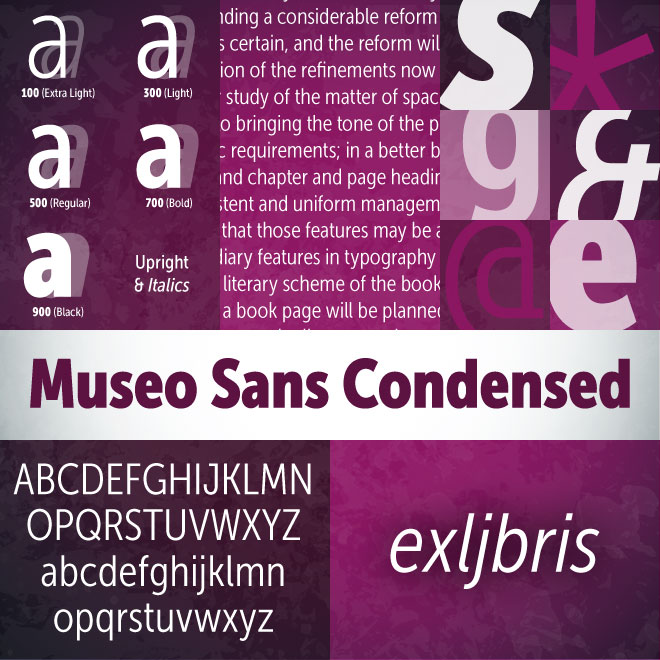
Museo Sans Condensed is a sturdy, low contrast, geometric, highly legible sans serif sister typeface of the wildly popular Museo Sans Family. It is well suited for heads and subheads on your website.
| Museo Sans Condensed | 10 Fonts | $25.50 Single | $134 Family | Preview Online |
Ashbury by Hoftype
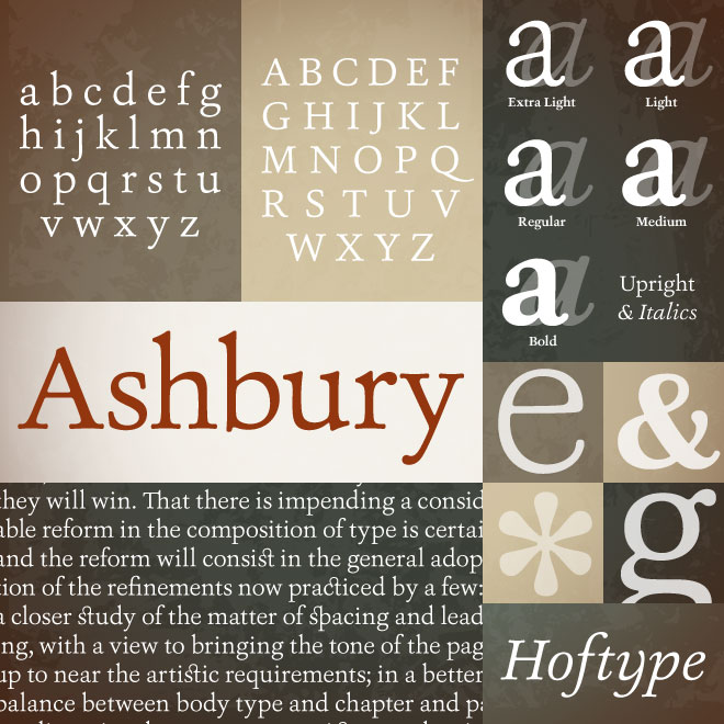
Ashbury is another winning font family from Hoftype. With a flowing outline, Ashbury has a warm, pleasant and assertive feel.
| Ashbury | 10 Fonts | $64 Single | $258 Family | Preview Online |
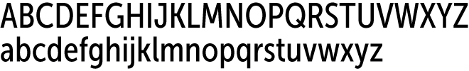
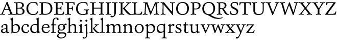
Insider by Characters Font Foundry

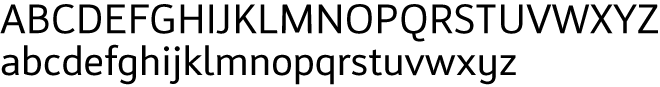
Insider is a highly legible humanist-sans family with solid proportions and well balanced inner forms.
| Insider | 8 Fonts | $25 Single | $175 Family | Preview Online |

|
New Foundry: DSTypeWe're proud to welcome DSType, an award-winning foundry in Portugal. Their collection is diverse, full featured and extremely well drawn. You can't go wrong with one of their faces. |
New Foundry: Talbot TypeFrom London, Adrian Talbot joins Fontspring with a nice collection of technical sans and slab-serif fonts. His designs are influenced by Modernism, Constructivism, and Art Deco. |
Awesome Value: Softmaker
|
 Softmaker earns our value badge this month. They have a large collection of classic fonts each in a wide range of weights and styles for great prices.
New Team Members
Fontspring is proud to welcome Dan Leach and John Giardiniere to the team. Ok, so Dan and John have actually been here a while, but better late than never. They are both here to serve you and our growing family of foundries. Learn a little more about these guys by visiting our newly revamped about us page.

|
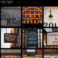
NYC type |
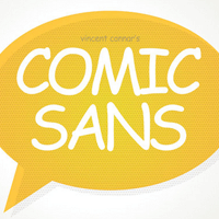
Comic Sans |
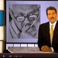
Three Mistakes |
|
Luke Connolly has assembled a wild variety of photographs of typography found on the streets of New York City. |
A creative and comical (pun intended) write up by Jad Limcaco about the history of Comic Sans. |
From a few years back, this segment by John Stossel highlights three very common design mistakes. |