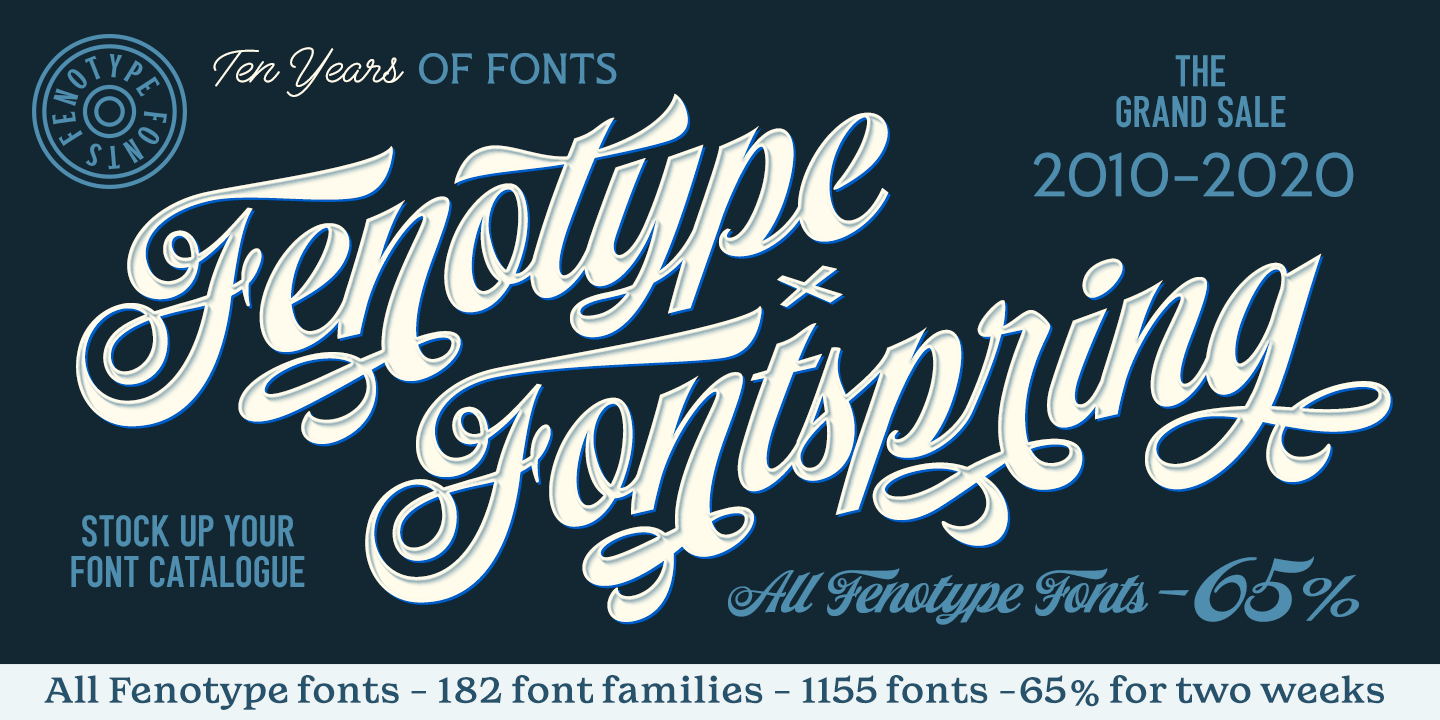
Ten Years: Fenotype and Fontspring
|
|
|
2020. Need I say more? Despite being a notorious year
full of existential dread, we look ahead with optimism, and we look back at the journey so far.
This year happened to mark the tenth anniversary of Fontspring’s first establishment in 2010. In
true synchronicity, it also marks the ten year anniversary of Fenotype, an
award-winning, top-selling Fontspring foundry. To celebrate this occasion, Fenotype is currently
offering 65% off their entire
Fontspring catalog!
|
|
|
|
|
For those unfamiliar with the name, Fenotype is
designer Emil Bertell’s Finland-based design company. You’ve seen many of his font families
featured in our Best of Fontspring lists over the past few years:
Best of 2017: Karu,
Letterpress Studio,
Roster
Best of 2018: Double
Porter (a Top-Tier Typeface)
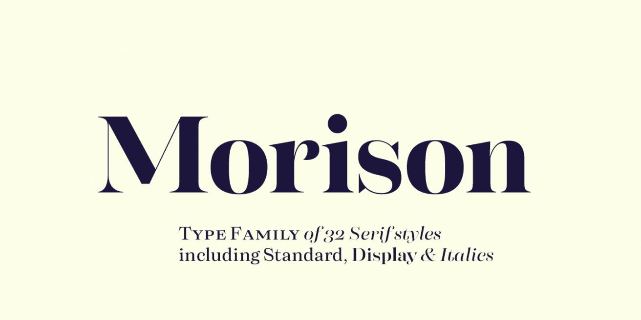
Best of 2019: Morison
(a Top-Tier Typeface), Agile
Sans, Fabrica,
Hops and
Barley, Zeit
|
|
|

|
|
|
We took some time to ask Emil a few questions about his
work, to commemorate the decade-long partnership of Fenotype and Fontspring.
FS: What’s the origin of the name “Fenotype”?
EB: I liked the meaning of “Phenotype”: (the set of observable characteristics
of an individual resulting from the interaction of its genotype with the environment) ... Plus
it has “type” in it. I also toyed with the idea of “Fennotype” as for Finnish-type but it felt
too complicated and doesn’t look as good with the double n.
|
|
|

|
|
|
FS: How would you describe your style?
EB: Synthetic script with the idea of embracing the possibilities of vector design
while trying to maintain the freedom of hand lettering as much as possible.
|
|

|

|
|
|
FS: What inspired you to start designing your
own fonts?
EB: I became aware of the concept of graphic design in high school. I attended
an art-oriented school and we did coding, animation and graphic design. I had to design a
calendar and I started to think about the huge impact that a typeface has in design, so I ended
up creating my first typeface at the age of 16. The font wasn’t that brilliant though.
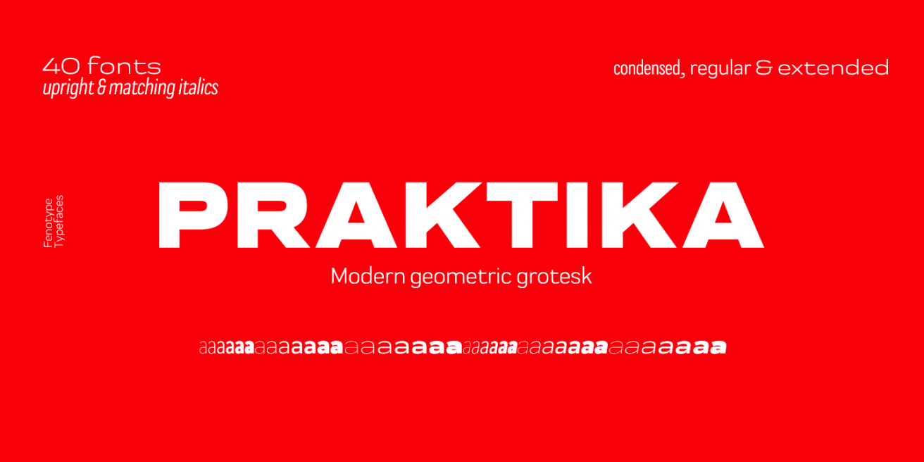
FS: If you had to pick a favorite, which of your font families would you
choose?
EB: Grand
Atlantic, Slacker,
Vodka, and
Praktika,
to name a few.
|
|
|

|
|
|
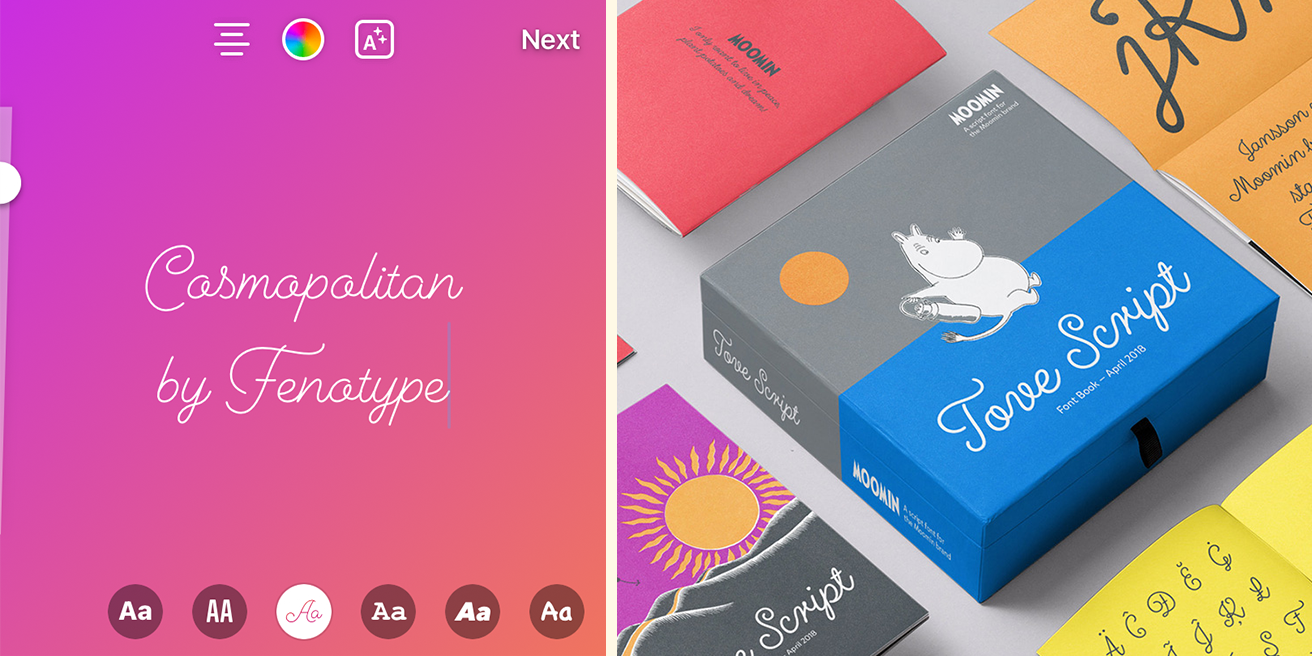
FS: What have been the highlights of your
typographic career?
EB: As for visibility, the biggest one is most likely the “neon” typeface that
users can utilize in Instagram Stories, that's Cosmopolitan
by me. Another really nice thing is that some years ago, Moomin Characters asked me to realize a
script typeface based on the hand lettering of Tove Jansson, the author and creator of the
Moomins. So that’s kind of a big deal here in Finland and probably in Japan too.
(To read more of the full interview on our blog, click
here)
|
|
|
|
|
Be sure to take advantage of Fenotype’s foundry-wide
sale while you can! The anniversary sale lasts until November 26th. You can view Emil’s entire
Fontspring catalog here.
|
|
|
Grab
any Fenotype’s font families now for a great low price!
|