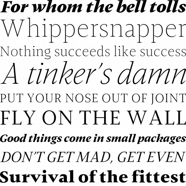
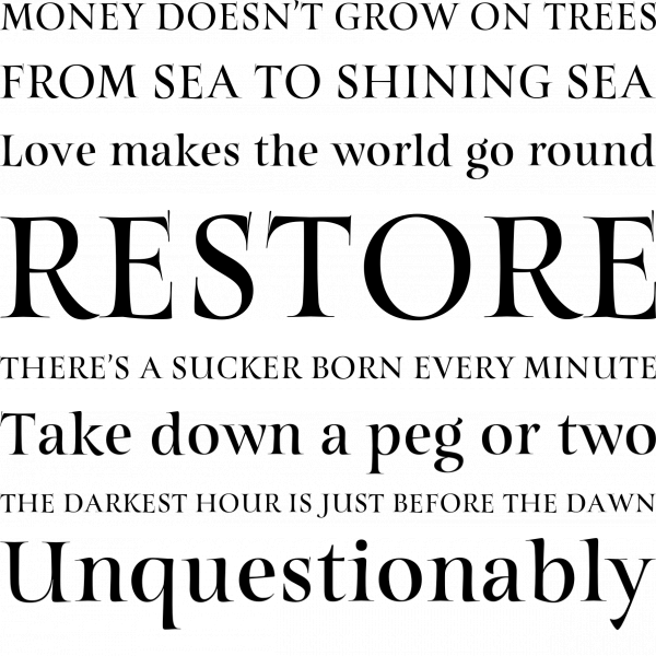
Didonesque
Paulo Goode | January 9, 2017
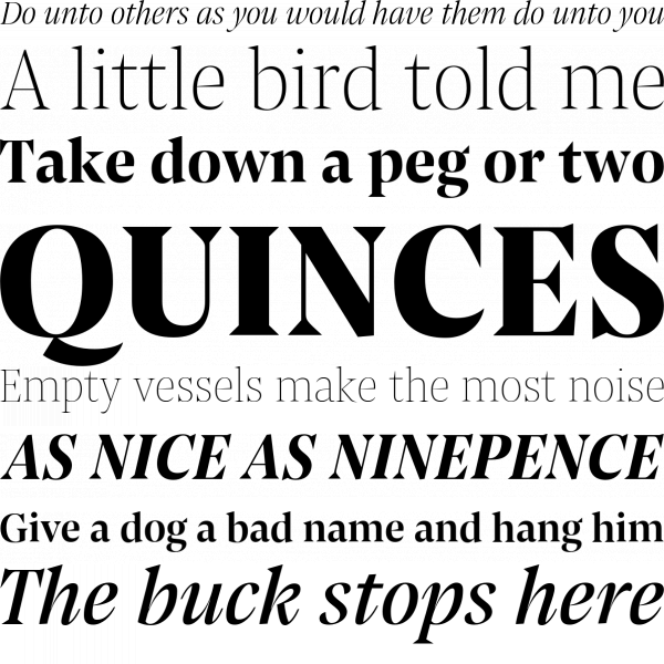
Paulo Goode shows a great reverence for didone fonts of the past with his photogenic Didonesque family. Make everything beautiful with high class and high contrast.
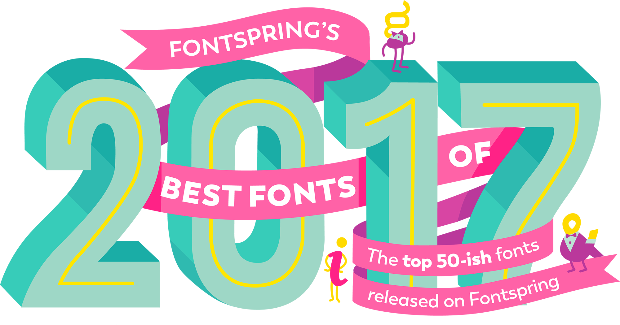
Fontspring is proud to present the best fonts of 2017. From sleek sans serifs, to striking slab serifs, to fun display families, this list includes only the highest quality font families released this past year. Out of almost 2,000 families released on Fontspring in 2017, we whittled the list down to the 60 top fonts shown below.
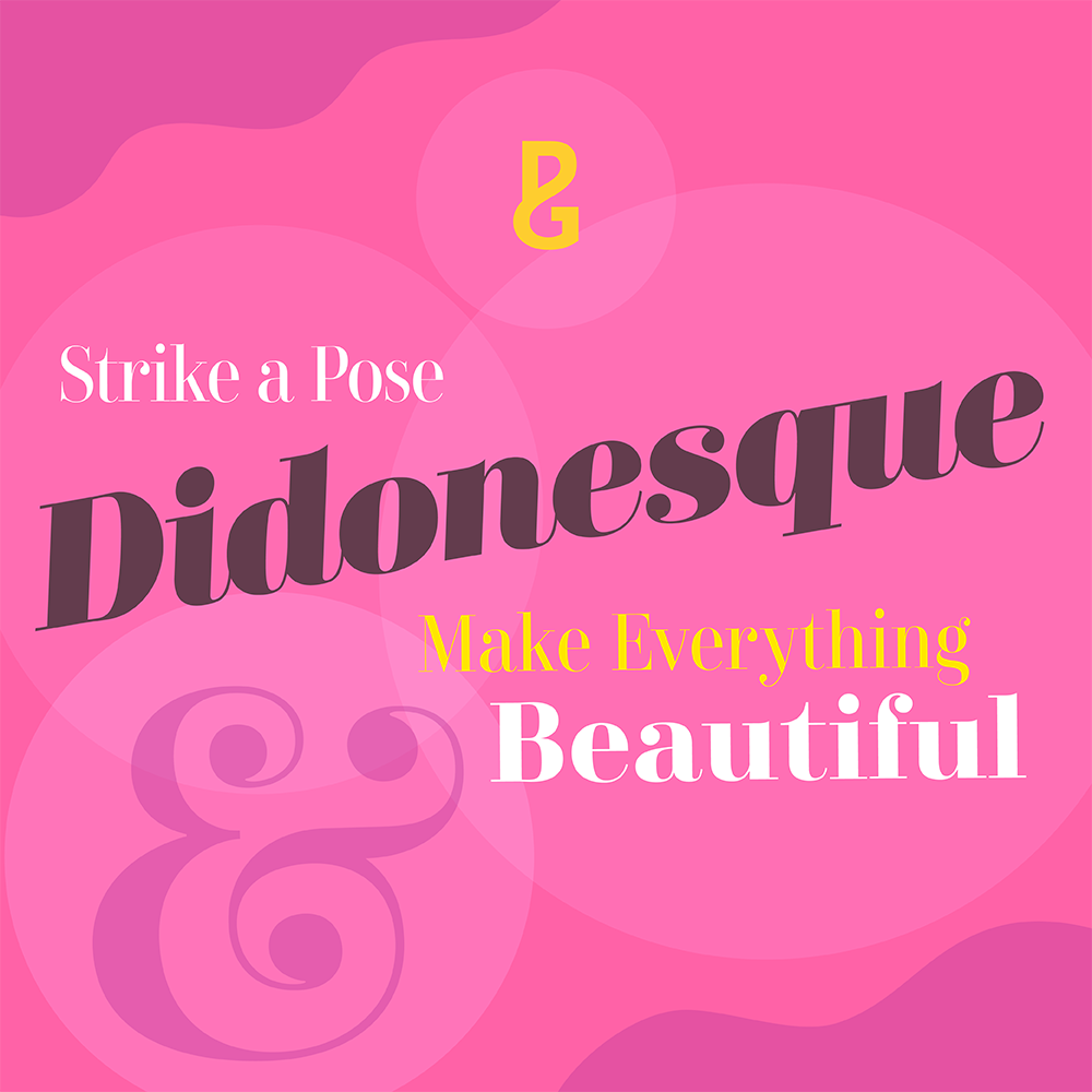
Paulo Goode shows a great reverence for didone fonts of the past with his photogenic Didonesque family. Make everything beautiful with high class and high contrast.
Ligature Inc | May 2017
Emtype Foundry | May 2017
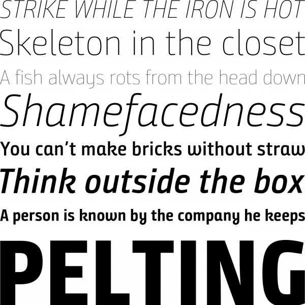
ROHH | July 2017
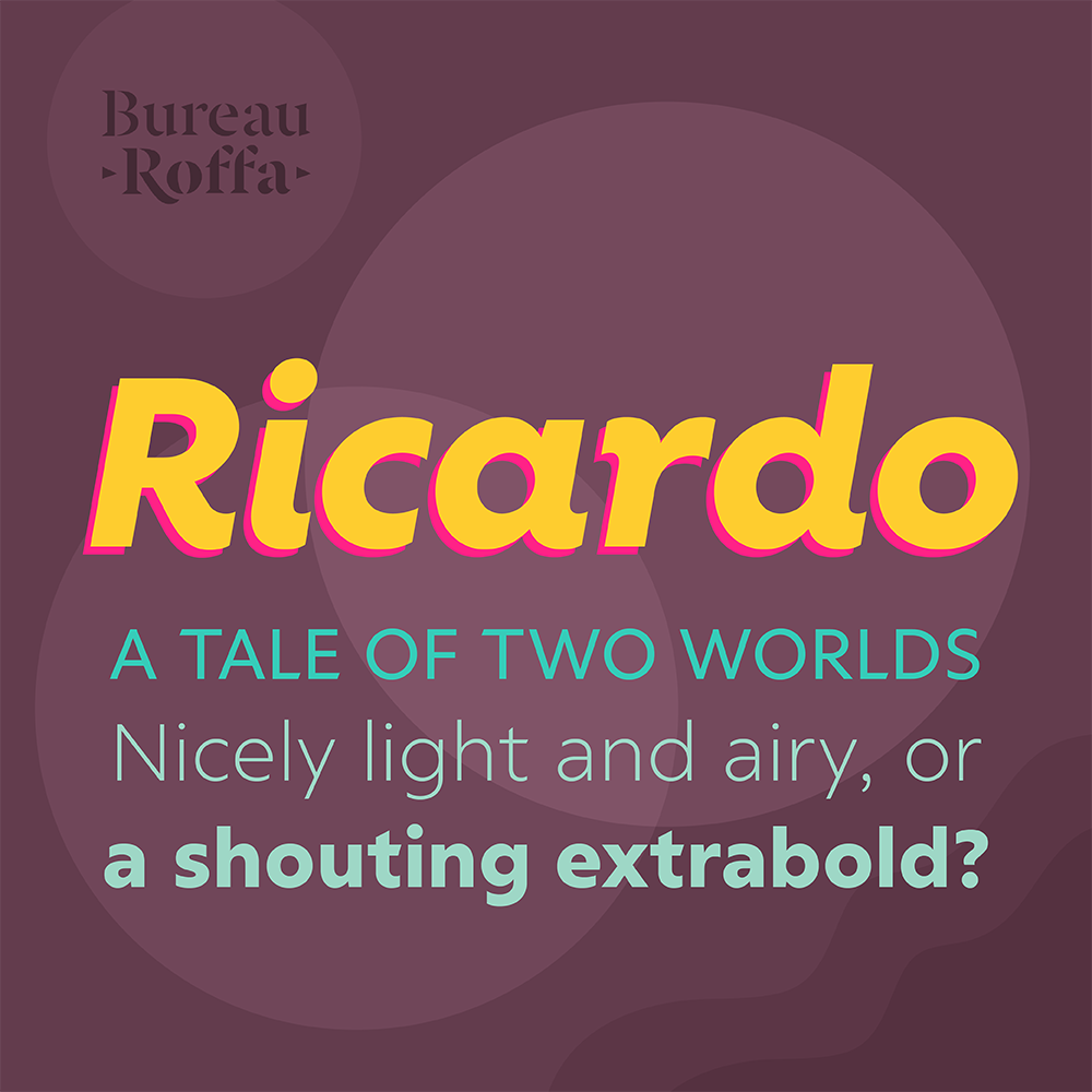
Ricardo is all about geometric simplicity, but it doesn’t sacrifice style in the process. Stylistic alternates and a set of curvy italics add some humanist flavor to an already eye-catching family.
Tyler Finck | March 2017
Kostic Type Foundry | April 2017
Artegra | March 2017
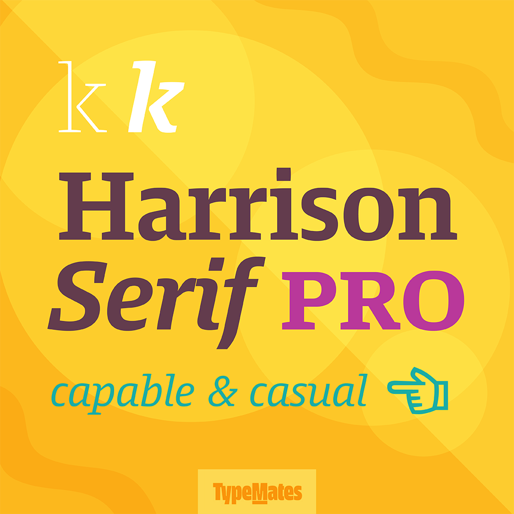
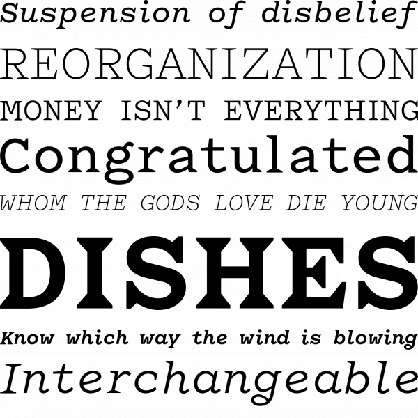
This sturdy slab serif has quite the range. From sheer hairline to ultra black, its masculine bone structure holds up at any weight. With a stable physique and nuanced italics, Harrison Serif Pro is fully capable of flexing its muscles or just playing it cool and casual.
Sudtipos | August 2017
Ndiscover | September 2017
Buntype | June 2017
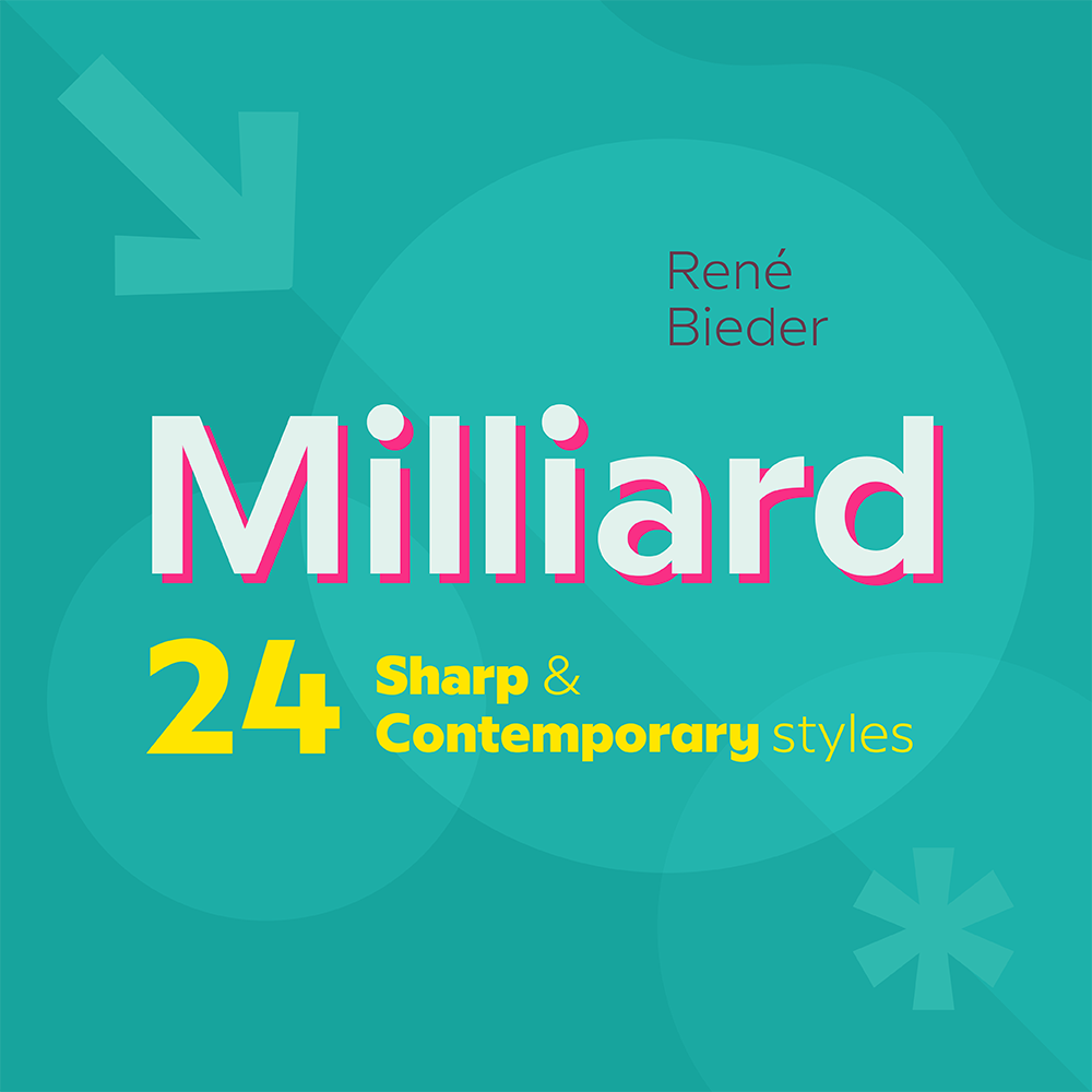
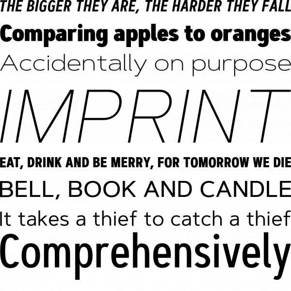
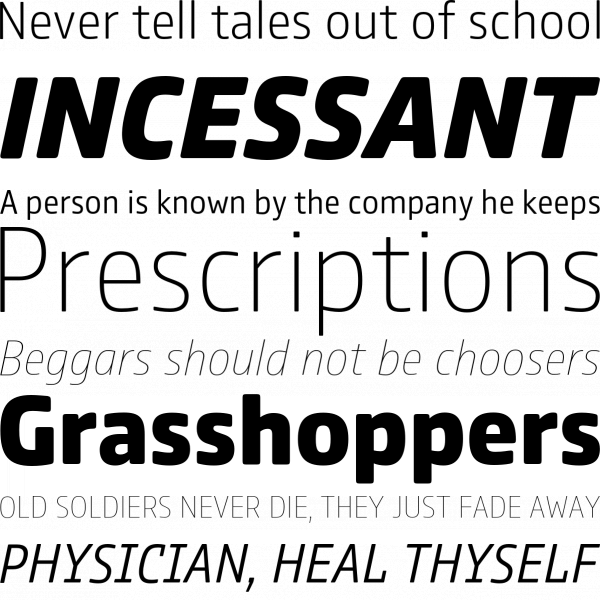
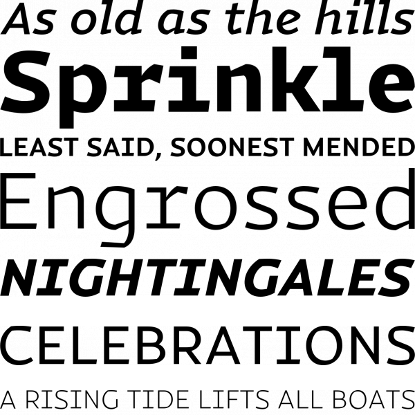
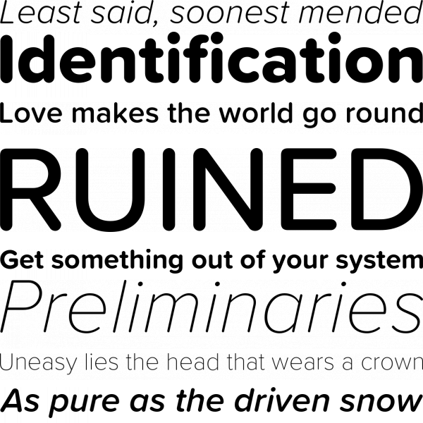
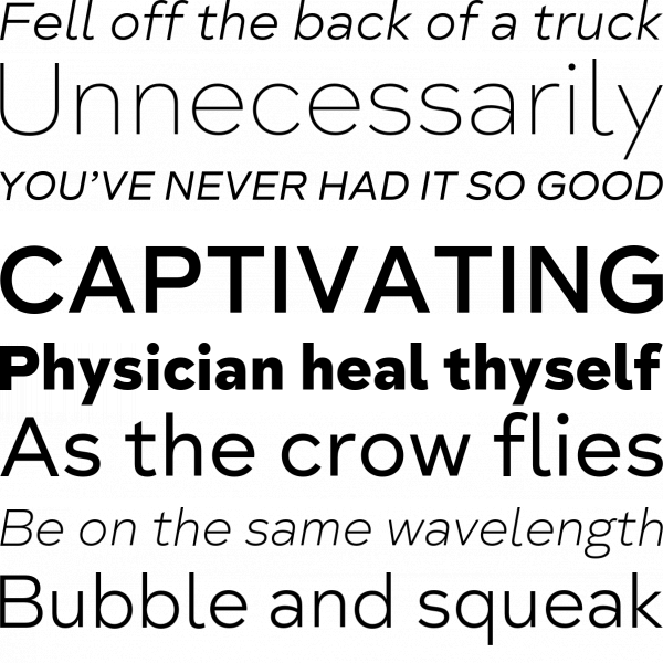
Milliard sets a new standard for clean and crisp sans. Ranging from elegant and open thin weights to athletic and powerful heavy weights, it’s a clear, unobtrusive mix of humanist and geometric elements.
Branding With Type | January 2017
Dharma Type | June 2017
Paulo Goode | June 2017
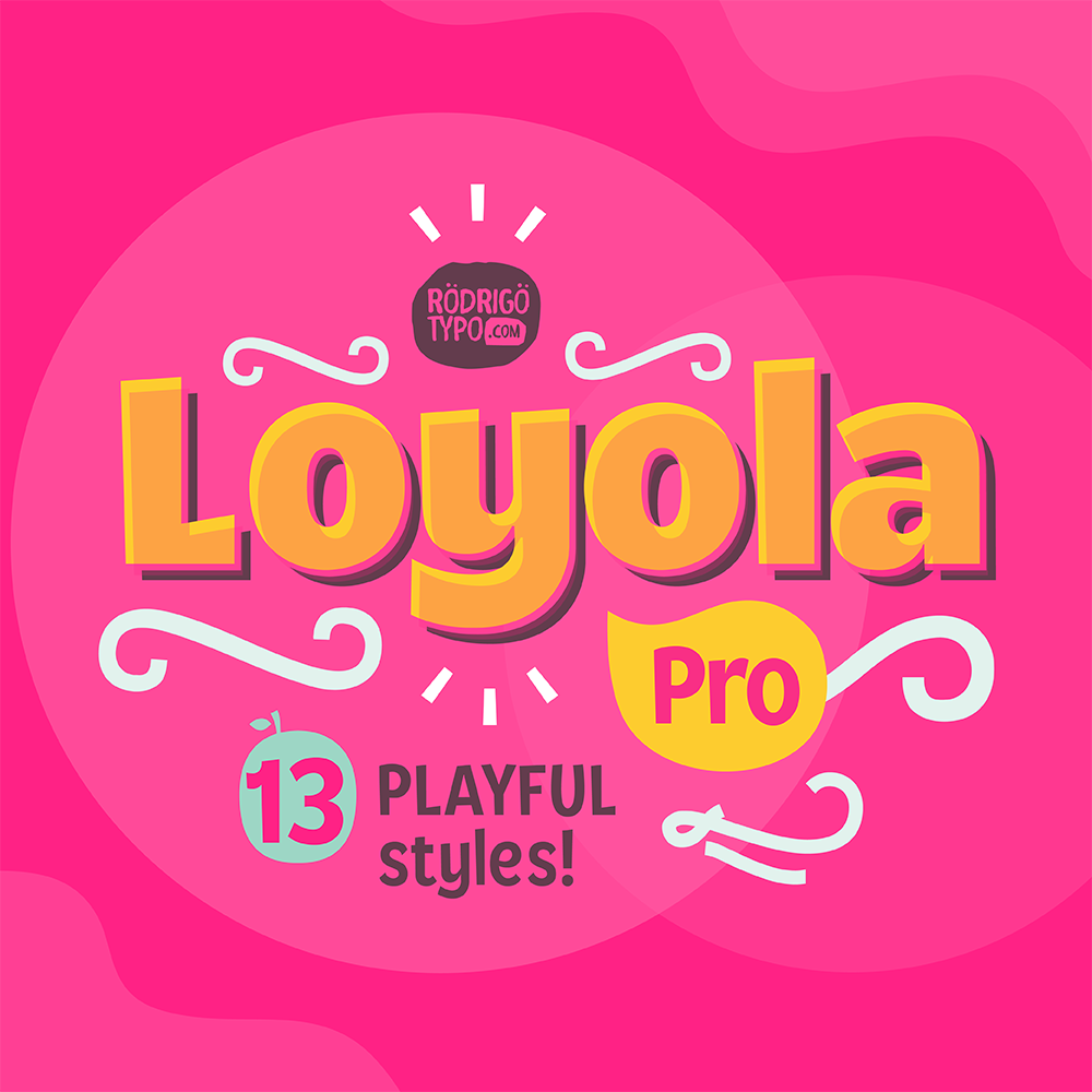
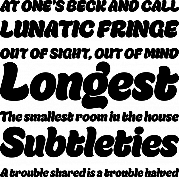
Rodrigo Typo has built a catalog of whimsical fonts and Loyola Pro is no exception. This elaborate set of comic layers and swirly ornaments is cute and playful but still plays by the rules enough to look great in a logo or title.
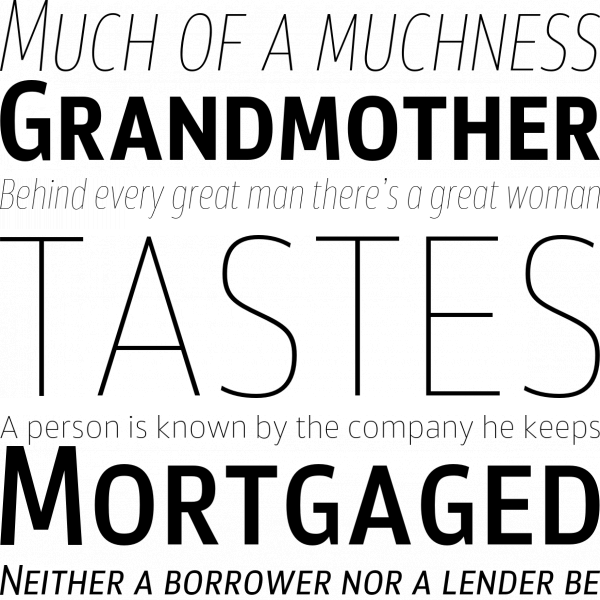
TypeMates | March 2017
Typedepot | January 2017
Eclectotype Fonts | August 2017
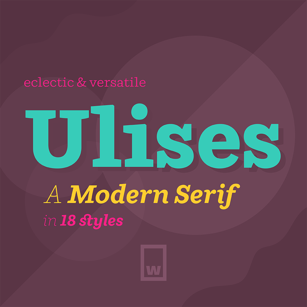
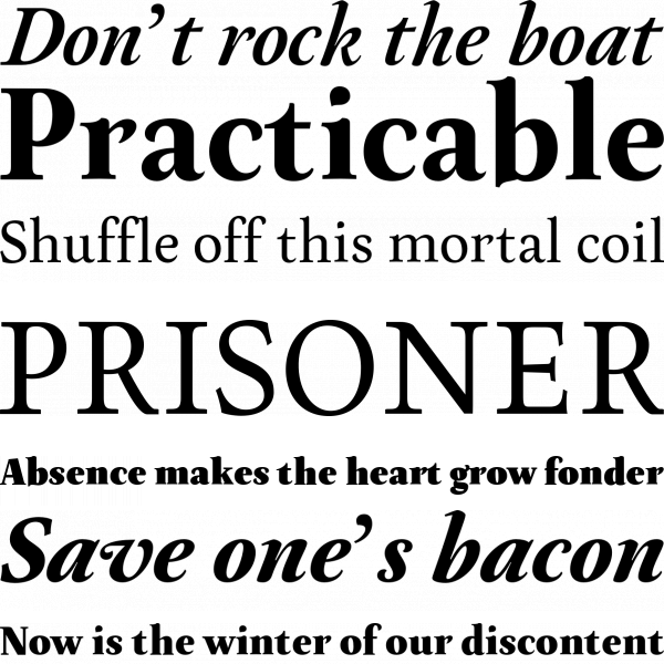
This handsome modern slab looks equally good sitting in a corporate headline as it does filling the text of a cookbook. With a strong but gentle appeal, Ulises balances out its crisp corners with its friendly curves.
Adam Ladd | August 2017
LetterMaker | September 2017
Rodrigo Typo | November 2017
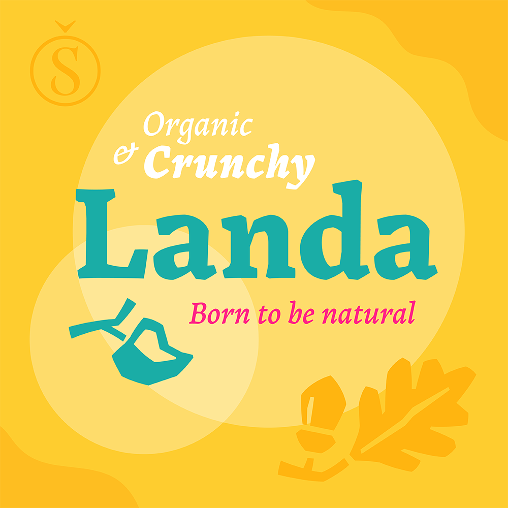
Landa doesn’t shy away from its crunchy edges. On the contrary, it revels in its beautiful imperfections as if each letterform was plucked off a tree branch.
Nicky Laatz | March 2017
ParaType | June 2017
Fenotype | May 2017
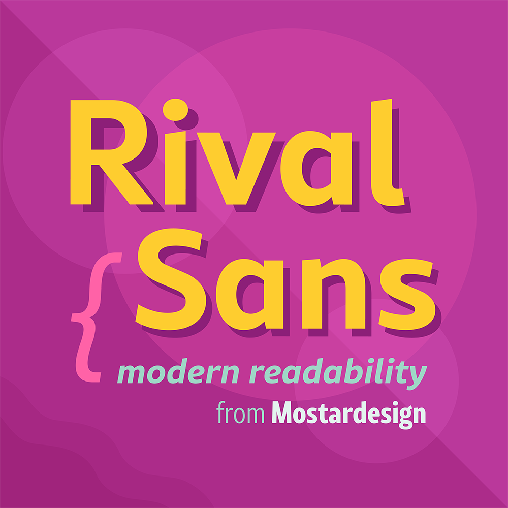
Mostardesign’s Rival Sans hits all the right notes with its carved out angles and appealing curves. This 32 font family comes with plenty of width and weight options to remain clean, and reader-friendly in any format.
Fenotype | July 2017
Typesenses | May 2017
Mostardesign | May 2017
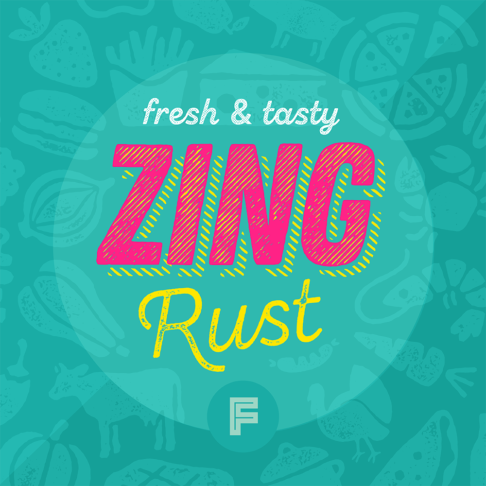
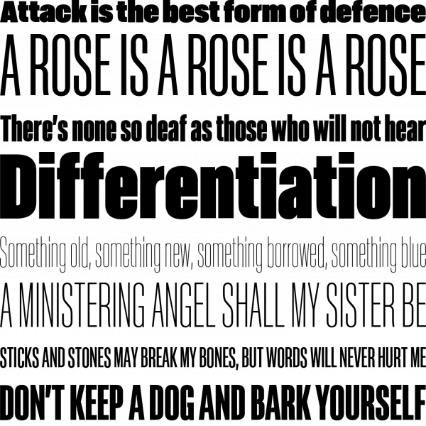
Zing Rust is a glorious smorgasbord of over 500 fonts! (Yes, you read that right!) This grunge family has it all: various styles, icons, banners, catchwords and texture out the wazoo.
Insigne Design | July 2017
TipoType | April 2017
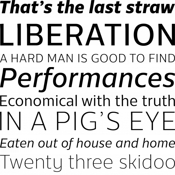
Untype | December 2017
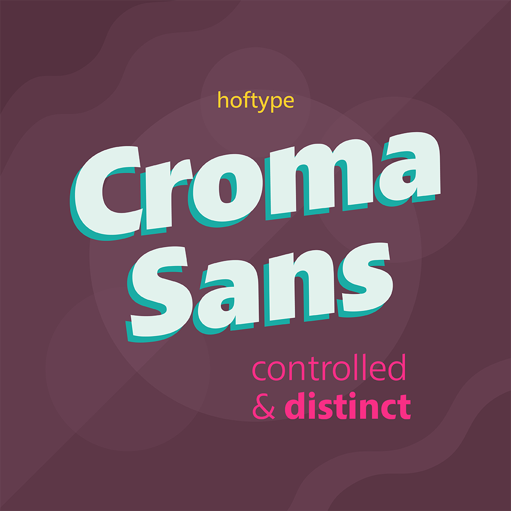
For a linear sans, Croma is ambitious and distinct. With its angled endings, there’s an optimistic energy that resounds throughout this substantial 16 font family.
MACHALSKI | March 2017
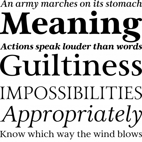
Adobe | August 2017
TypeMates | September 2017
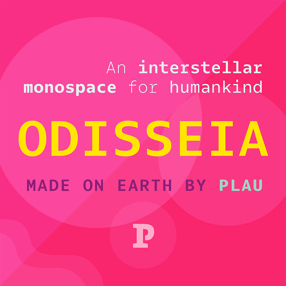
Sometimes we all need a little space. Influenced by computerized futuristic technology, Odisseia is a beautiful monospaced family that is surprisingly versatile. Use it for coding that’s easy on the eyes, or incorporate it into a contemporary brand design.
Maciej Włoczewski | February 2017
Sudtipos | September 2017
Mark Simonson Studio | January 2017
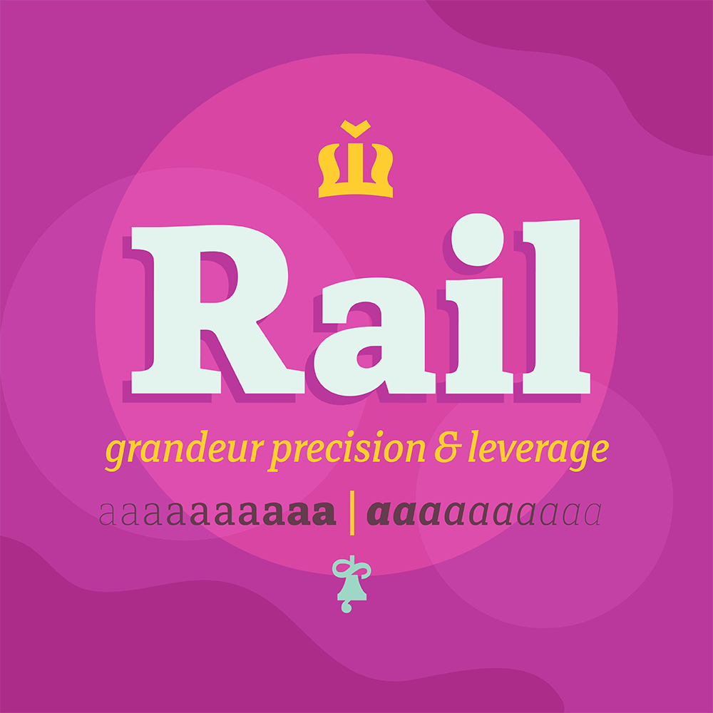
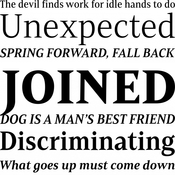
As its name suggests, Rail was designed as a conveyance mechanism to take our eyes from point A to point B in an ergonomic fashion. This serif family has been engineered with utmost precision to handle complex type projects, and stand the test of time.
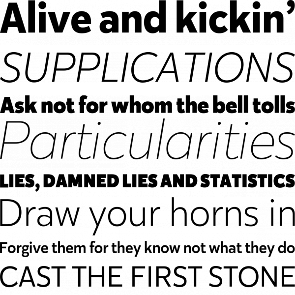
Mostardesign | January 2017
PeGGO Fonts | March 2017

Fenotype | May 2017
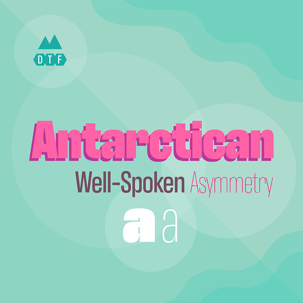
This headline and monospace family demands attention at large sizes and remains very legible at small sizes. Just look at those super deep notches and striking asymmetric contrast.
Dharma Type | June 2017
Eclectotype Fonts | March 2017
Adobe | November 2017
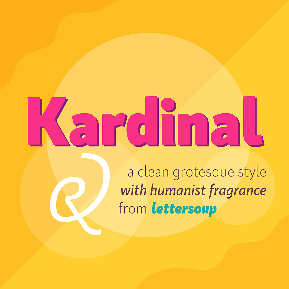
Kardinal holds a lot of personality in a streamlined grotesque sans. Zoom in on it and you’ll find some subtle sloping serifs, strategic ink traps, and stylish italics. It’s the little details that set this one apart.
Jason Vandenberg | January 2017
Latinotype | January 2017

Typetype | May 2025
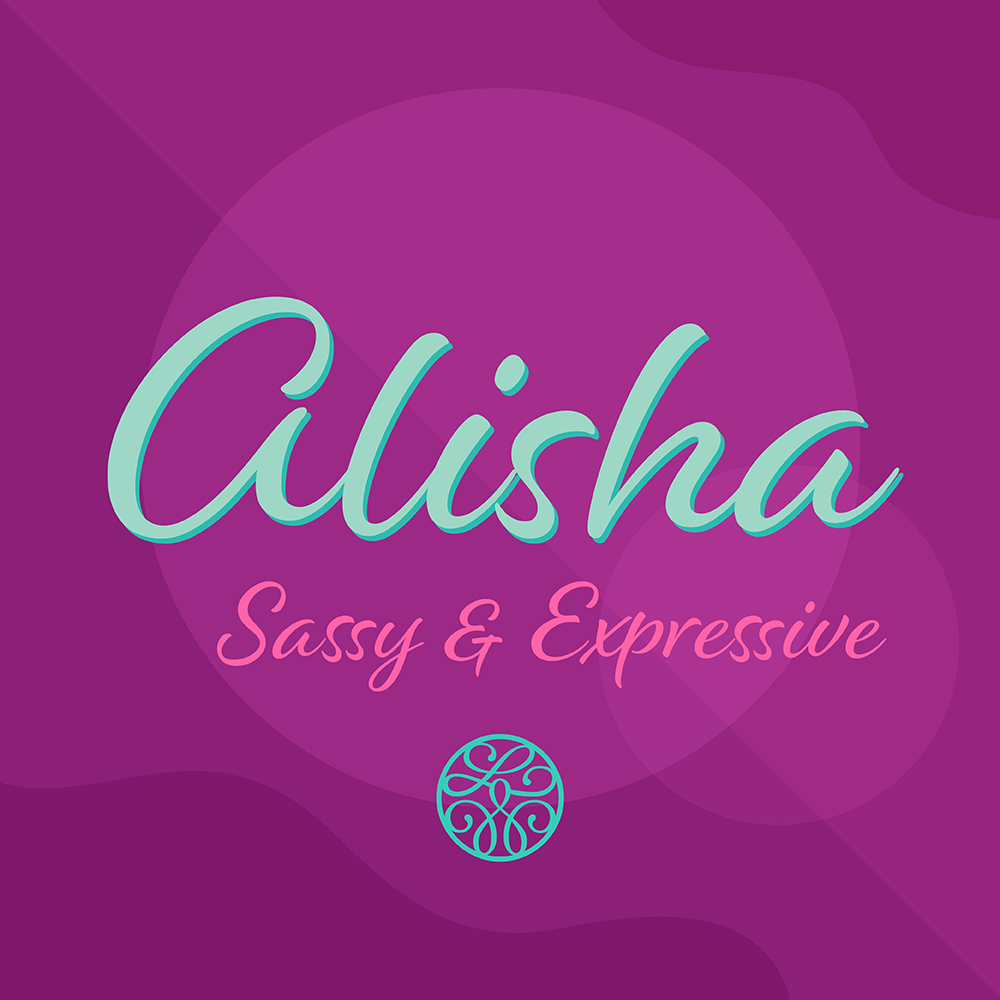
Laura Worthington has designed Alisha to retain the distinctive look of custom lettering. With more than enough decorative swashes and alternates to captivate any reader, this script will leave you spellbound.
Resistenza.es | April 2017
Hoftype | September 2017
Huy!Fonts | September 2017
By its very nature, a list like this is fairly subjective. What does “best fonts” actually mean? To get that answer, we started by analyzing sales figures for 2017. We included several font families primarily because they were a hit with customers...these are great looking families that also sold very well on our site. Other families were added to this list not because they necessarily sold as well, but because they were the epitome of what a typeface could be: gorgeous and painstakingly crafted by skilled designers.
And we had a lot of families to choose from. There were almost 2,000 families released on Fontspring this year, so whittling that list down required a lot of back and forth. In fact, we were shooting for a list of 50 top fonts and we couldn’t quite do it. But we had to draw the line somewhere, and what we ended up with was 60 fonts that cover the wide range of styles and classifications we feature on our site.